Modals
Default Modal
Use modal-dialog class to show default modal.
Next.js Preview
Vertically Centered Modal
Use modal-dialog-centered class to show vertically center the modal.
Next.js Preview
Grids in Modals
Use container-fluid class within the modal-body to utilize the Bootstrap grid system within a modal by nesting.
Next.js Preview
Static Backdrop Modal
Use data-bs-backdrop="static" to modal not to close when clicking outside the modal.
Next.js Preview
Toggle Between Modal
Toggle between multiple modals with some clever placement of the data-bs-target and data-bs-toggle attributes. Please note multiple modals cannot be open at the same time. this method simply toggles between two separate modals.
Next.js Preview
Scrollable Modal
Use modal-dialog-scrollable class to create a modal scrollable.
Next.js Preview
Varying Modal Content
Next.js Preview
Optional Sizes
Use modal-fullscreen, modal-xl, modal-lg, or modal-sm class to modal-dialog class to set different size modal respectively.
Next.js Preview
Fullscreen Responsive Modals
Below mentioned modifier classes are used to show fullscreen modal as per minimum screen requirement.
Next.js Preview
Animation Modals
Use fadeInRight, fadeInLeft, fadeInUp, flip, or zoomIn class to modal class to set different modal with animation effect respectively.
Next.js Preview
Modal Positions
Use modal-dialog-right, modal-dialog-bottom, or modal-dialog-bottom-right class to modal-dialog class to set modal at different positions respectively.
Next.js Preview
Custom Modals Example
Success Message
Here is an example of a sweet alert with a success message.

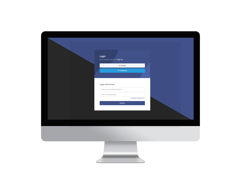
Login Modals
Here is an example of a sweet alert with a error message.

Subscribe Modals
Here is an example of a sweet alert with a warning message.

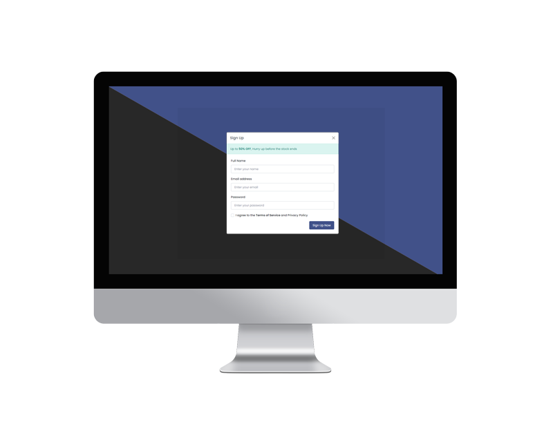
Sign Up Modals
Here is an example of a sweet alert with a community registration field.
